Color Coming Alive

In my last post, The Color of Being Human, I wandered in the realm of Johannes Itten and his book, “The Elements of Color.” He made the point that the truest secrets of color are invisible to the eye and are held by the heart alone. “Color is the radiant energies that affect us positively or negatively whether we are aware of that or not.”
In the Renaissance, it was about contrasts, warms and cools and lights and darks that compel thought. Tones were restrained, but the deep emotions and beliefs of the painters were not.
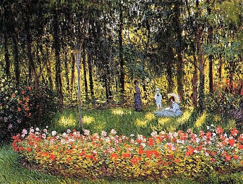
Then the Impressionists exploded upon the scene gaining spiritual radiance from colors rendered in equal brilliance. This is “The Artist’s Family” by Claude Monet.
Ah yes, the Impressionists. Who isn’t captured by their ability to capture sunlight at various times in a day on a whole array of surfaces. And how tones are altered creating patterns. Monet led the way. He experimented widely with light and color and would sometimes track the progress of the sun and the games it plays with our visual reality.
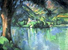
Cezanne followed with a “logically developed” color construction. He wanted to fashion Impressionism into something substantial with formal chromatic principles. He modulated a color by varying cold and warm, light and dark with dull and intense for vivid harmonies – not just faces and figures like Titian and Rembrandt but the whole picture—formally, rhythmically and chromatically. The canvas would be a continuous area modulated internally—every brushstroke contributing equally.
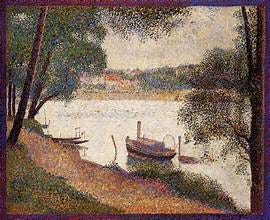
Then came the Neo-impressionists who separated color areas into point elements and were called “Pointillists.” Dots or specks of pure color became mingled only in the eyes of the viewer. Georges Seurat, here with “The Seine at La Grande Jatte in the Spring,” is identified as the most prominent of the movement, but…
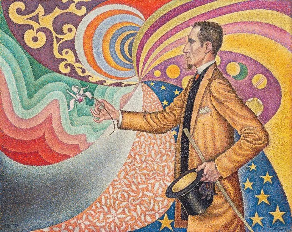
…Paul Signac and others were very much in search for the pure, almost mathematical approach to color, here with “Opus 217.”
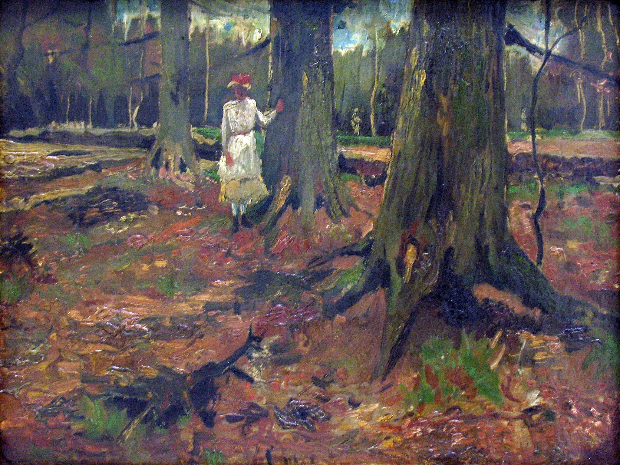
Johannes Itten made a distinction between the “Neo-Impressionists” who were looking to be free from restraints in color, to “Post-Impressionists” who were looking to unleash its emotional power. There are many familiar names, but none more so than Vincent Van Gogh, here with “Girl in a Wood,” composed entirely on a cold-warm theme.
When I went to the ultimate Van Gogh exhibit in Amsterdam in 1999, almost all of his work was shown sequentially, by date of completion. I could see them in the order they were painted, and how there was no smooth transition from one style to the next. I was very surprised to discover that “Starry Night” was not the culmination of his search. His next painting from that same window in the asylum at Saint Remy de Provence, appeared more as a traditional landscape.
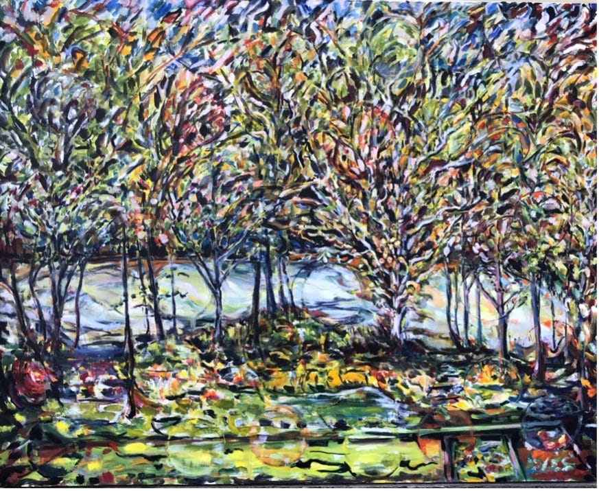
Here’s a question: What’s the color of pure emotion? While looking through these various eras and different approaches to color, I often wonder how I should use color to depict PTSD. What color is it?
This is my “Church Creek.” I try to see the creek the way the various painters would see it, and not just the “Old Masters.” I have interviewed and profiled hundreds of living artists for 25 years. And all these fine people have emotions. Very strong emotions and ideas about color. I try to see the creek through their eyes. But I am all over the place with color and movement and form.
Will PTSD ever let me settle on one? Or are the truest secrets of color invisible to the eye and held by the heart alone?
I would be very interested in pursuing this concept that you are considering… based upon color theory and application! … Martha
I'd say my PTSD color changes with every different trigger. The worst is a jet black kind of black. Not like looking at a black canvas, but all encompassing your mind. Think moonless night, in a steep dive at 400 mph into a hail of AAA. It's a kind of high velocity blackness.
But then there's also a glowing green vision, as I flashback on the fear-filled nights staring at that aircraft FLIR screen, hunting those trying to kill us late at night over the Persian Gulf.
35 years later the black gets darker, and the green glows more intense.